Design Systems with Web Components

If you have ever worked for a company that has several disparate sites, built with multiple technologies, keep reading. We will walk through building principles behind good Atomic Design, how to create Web Components using Stencil, and finally (perhaps most importantly) how to allow your company to create and adopt a design system.
TLDR - Use Web Components to make a successful Design System.
Flipping the Script on Design Systems
I was recently able to sit down with some of the core members of Ionic, who also created Stencil a toolchain for building Design Systems and Progressive Web Apps. We talked at great length how typically companies are approaching Ionic from a Design Team and need help building components. As a developer I wanted to talk about the Web Components that are used within the Design System first. There was a decent amount of surprise, so I thought I would break down what a Design System is and why it doesn't matter which end you start with, as long as you have both your Design and Development teams working together to build your Design System.
Atomic Design Principle
In my opinion, Atomic Design by Brad Frost is the most expertly written guide. Brad breaks down Atomic design, as it would relate to elements within Chemistry. The key in Atomic Design is to remember that you are building from the most finite component until you build a full page.
There are a 5 stages to Atomic Design:
- Atoms
- Molecules
- Organisms
- Templates
- Pages
From my (limited) experience most Front-End Developers are worried about Atoms, Molecules and Organisms. UI/UX Designers are worried about Organisms, Templates, and Pages. When in reality they BOTH need to consider all 5 stages.
Atoms
Atoms are the smallest parts in a good design, these are things like buttons, text elements, and images. You will notice that even in these basic atoms, your developers will want to know how performant the atom renders and reacts. For example in a button the "click" animation must remain very fast on both desktop and mobile. Your designers will want to allow the color, font, border, and icon placement. We can already start to see that it is necessary that both roles will need to have agreement on each of the components.
Molecules
Molecules are a grouping of these atoms into a logical relationship. For instance we could use an avatar image, label text, and button to create a avatar-item-nav molecule. Now we have a simple, functional, reusable component that we can use in many different locations.
Now Organisms can use both Atoms and Molecules to build out complex components. You can even get really meta and have Organisms use Organisms! I like to use cards (maybe even way too much), so lets use our components from above. Lets say we are building a Book Design System and we want to have an Author Card. This Author card will have the avatar-item-nav which will show the author avatar, the author name, and a button to navigate to the Author's Bio. So lets go down that meta thought, we can take this author-card and place it inside a larger book-card comopnent that has a Book hero-image component and Title. The great part about these organisms is that we can repeat them easily based on dynamic data.
Templates
This is the standardized way that we implement all of the Atoms, Molecules and Organisms across all of your different technologies. Many people use design tools like Sketch or my favorite Figma, to layout each of these different template types. This is many times known as the skeleton of your page, where each of the elements will be placed on the different page types like Home Page, Product Page, and Contact Page. The important part here is to get the correct structure not the content.
Pages
Now you can continue to use those design systems to build the actual content within each template. This is "where the rubber hits the road", you will find out how many tweaks each template, organism, molecule and atom will require to make utilzing all of the components across all of your different systems.
Why did you say flip the script?
Seems all straight forward right, doesn't everyone think this way? Well you are probably a developer not a designer. My design friends would have said we need to set the Typography, Color, and Styles. This is why I said you need to work TOGETHER to create all 5 stages in the design. While the designer is creating lets say the colors, the developer should be making the CSS portable enough to allow every single component to utilize a single source to update those colors. Often companies will start by designing multiple pages and then telling the devs to just figure out how to create them. This is why I think you should "Flip the Script".
A good resource for more on Design Systems is Figma Blog.
Web Components with Stencil
So we talked a lot about the Atomic Design Principle, but you could just use that in any system and start creating. You could have Angular components, React Components, and Vue Components. But if you notice these don't easily work Everwhere. So the solution is to use Web Components because the modern browser can already understand these, and any Front-End framework can then utilize these components. You can use Electron for desktop (Slack, VSCode), PWA for both Android and iOS, and across all browsers Can I Use.
This naturally allows tools like Stencil to create the web components that can be centrally located and updated. This also means that you can then use those components in any Framework or in no Framework at all.
Create Stencil Components
First we are going to create a stencil component project and start creating all of the required components. If you are familiar with ReactJS or JSX you will feel very comfortable. Similar to ion-core that the Ionic team used Stencil to build, we will be creating <yourname>-core, so for example ajonp-core.
npm init stencil
Choose:
- component
- Project Name: ajonp-core
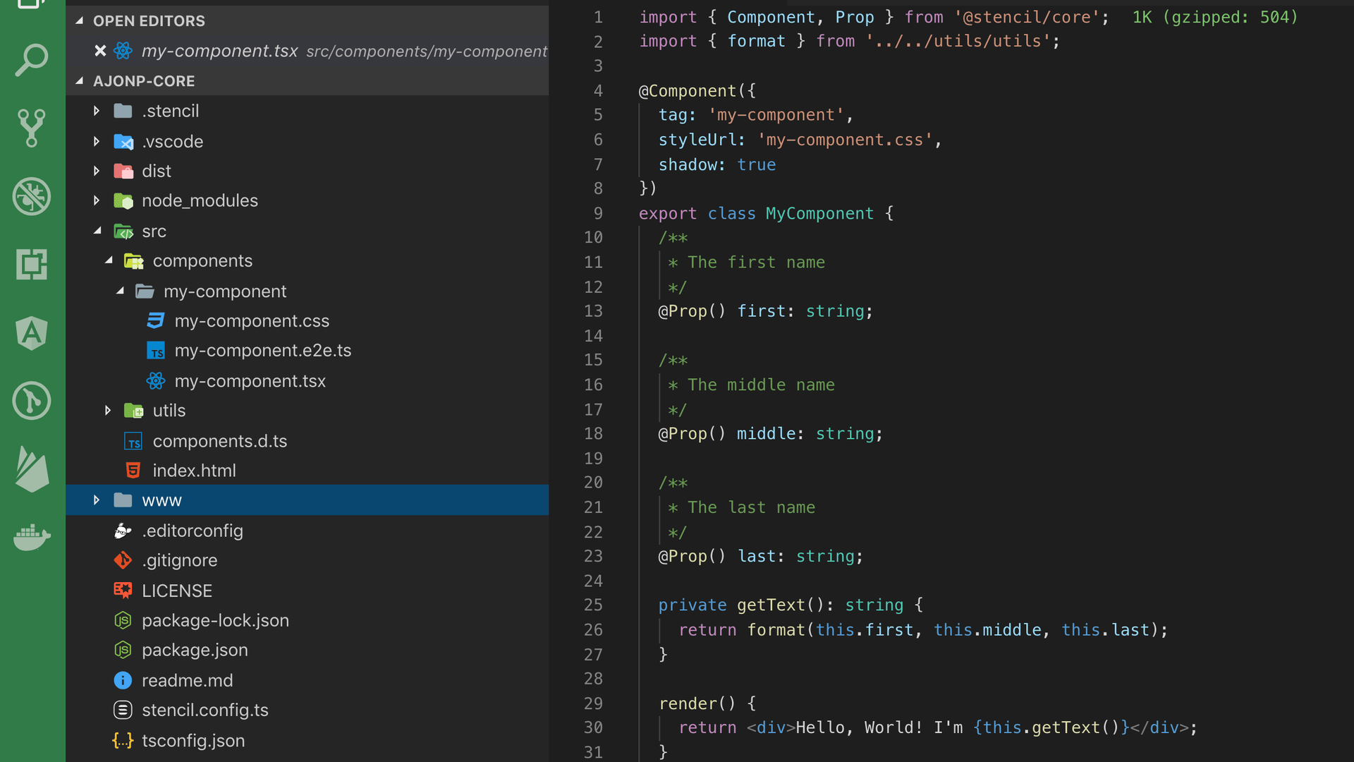
Now if you change into your project directory you will see a simple setup that has components directory with a starter my-component. This is a basic component that returns a <div> with your first, middle, and last names that were passed in using props.
This new component can be used simply by providing it into an <html> page. You can see this in index.html, in this new Web Component it is passing 2 props
first="Stencil"
last="'Don't call me a framework' JS"
<my-component first="Stencil" last="'Don't call me a framework' JS"></my-component>
This might seem like magic, well it is kinda magic! If you look closely at the index.html you will notice that there is a script being imported <script src="/build/mycomponent.js"></script> which provides the required javascript that is used for your component.
You can then run this project and see it in your browser.
npm run start
For a much further detailed guide please checkout Getting Started.
Create Atoms
For the button we will build out a simple Blue Button which takes in a slot that allows for child components to be passed. In our case this will just be some text.
src/components/ajonp-button/ajonp-button.tsx
import { Component } from '@stencil/core';
@Component({ tag: 'ajonp-button', styleUrl: 'ajonp-button.css', shadow: true })
export class AjonpButton {
	render() {
		return (
			<button>
				<slot />{' '}
			</button>
		);
	}
}
src/components/ajonp-button/ajonp-button.css
button {
	background: #5851ff;
	color: white;
	margin: 8px;
	border: none;
	font-size: 13px;
	font-weight: 700;
	text-transform: uppercase;
	padding: 16px 20px;
	border-radius: 2px;
	box-shadow: 0 8px 16px rgba(0, 0, 0, 0.1), 0 3px 6px rgba(0, 0, 0, 0.08);
	outline: 0;
	letter-spacing: 0.04em;
	transition: all 0.15s ease;
	cursor: pointer;
}
button:hover {
	box-shadow: 0 3px 6px rgba(0, 0, 0, 0.1), 0 1px 3px rgba(0, 0, 0, 0.1);
	transform: translateY(1px);
}
index.html
To get an idea of how detailed a button can become see what Ionic built with ion-button!
This is just a simple text element that you can pass in a hex color code to change the color, however this element will always be uppercase and a predefined size of 13. Notice here we introduces the element
src/components/ajonp-label/ajonp-label.tsx
import { Component, Prop } from '@stencil/core';
@Component({ tag: 'ajonp-label', styleUrl: 'ajonp-label.css', shadow: true })
export class AjonpLabel {
	@Prop() color: any;
	render() {
		return (
			<p style={{ color: this.color }}>
				{' '}
				<slot />{' '}
			</p>
		);
	}
}
src/components/ajonp-label/ajonp-label.css
p {
	font-size: 13px;
	font-weight: 700;
	text-transform: uppercase;
}
index.html
<ajonp-label color="#4b0a75">AJonP Label</ajonp-label>
This is again a very simple atom style of component that takes in an image url again using props into the src attribute and makes it round like an avatar.
src/components/ajonp-avatar/ajonp-avatar.tsx
import { Component, Prop } from '@stencil/core';
@Component({ tag: 'ajonp-avatar', styleUrl: 'ajonp-avatar.css', shadow: true })
export class AjonpAvatar {
	@Prop() src: any;
	render() {
		return <img src={this.src} />;
	}
}
src/components/ajonp-avatar/ajonp-avatar.css
img {
	border-radius: 50%;
	width: 50px;
	height: 50px;
	object-fit: cover;
	overflow: hidden;
}
index.html
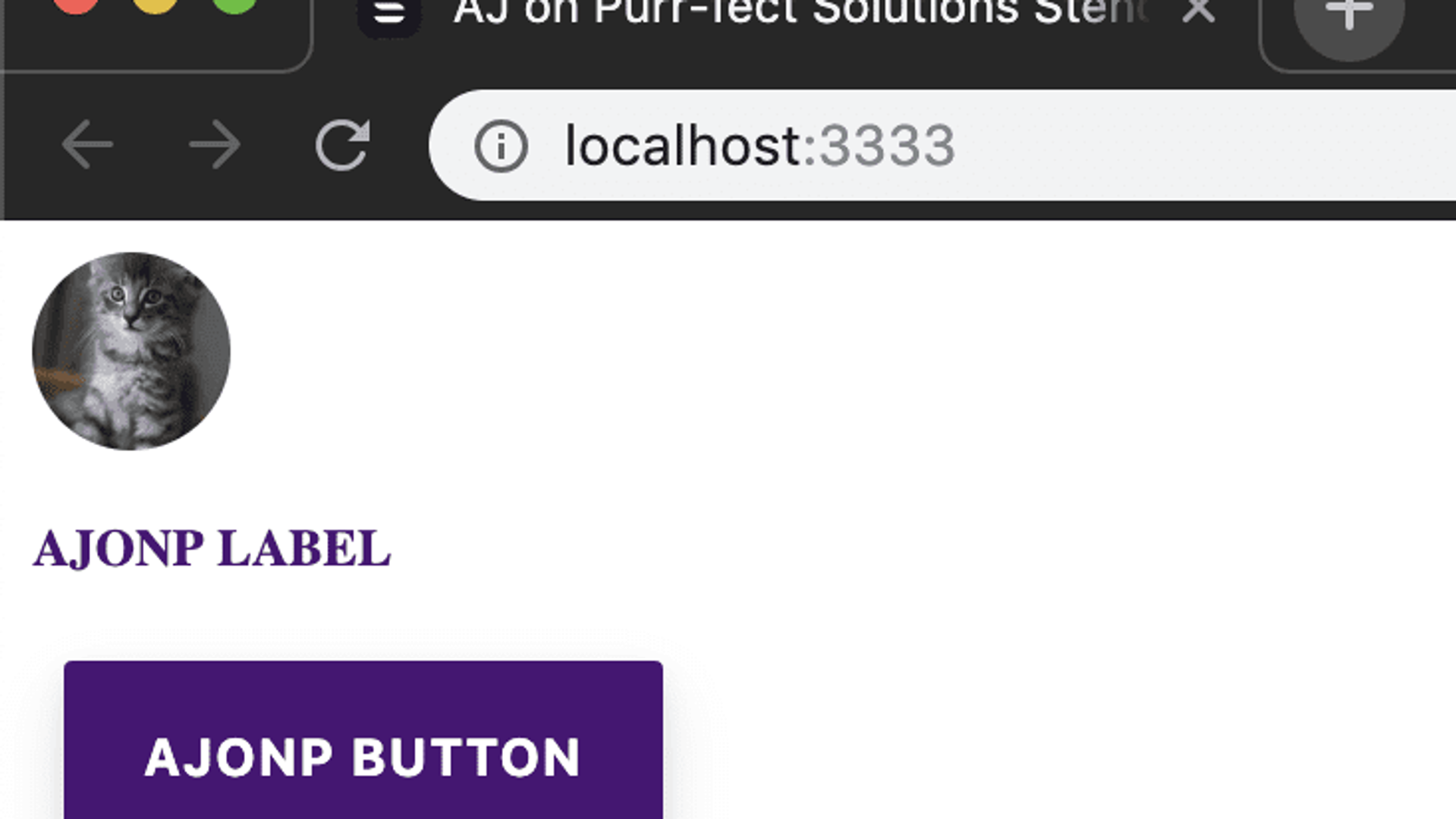
Now we should start to see that all of these Web Components can easily be shown on the screen each time when we added them to our index.html. These are by no means production ready, but you get the general idea of what the makeup of an Atom should contain.
You should see something like this if you run
npm start
Create Molecules
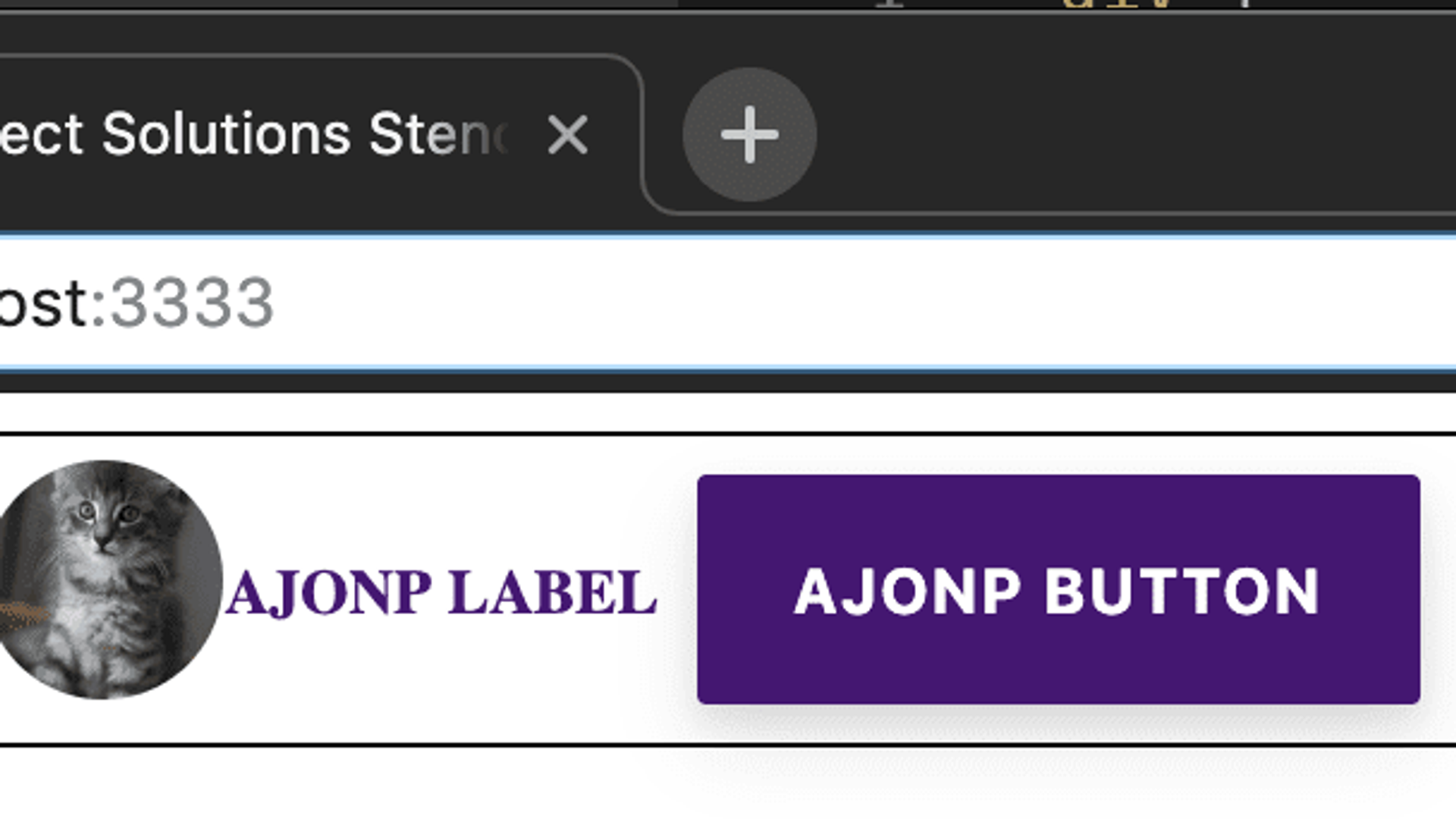
We can now take the three atoms that we built above and create a single Molecule for displaying the three items inline.
src/components/ajonp-item/ajonp-item.tsx
import { Component, Prop } from '@stencil/core';
@Component({ tag: 'ajonp-item', styleUrl: 'ajonp-item.css', shadow: true })
export class AjonpItem {
	@Prop() color: string;
	@Prop() src: string;
	@Prop() labelText: string;
	@Prop() buttonText: string;
	render() {
		return (
			<span>
				{' '}
				<div>
					{' '}
					<ajonp-avatar src={this.src} /> <ajonp-label color={this.color}>
						{this.labelText}
					</ajonp-label> <ajonp-button>{this.buttonText}</ajonp-button>{' '}
				</div>{' '}
			</span>
		);
	}
}
src/components/ajonp-item/ajonp-item.css
div {
	display: flex;
	align-items: center;
	justify-content: center;
}
span {
	display: flex;
	flex-direction: column;
	align-items: center;
	justify-content: center;
	border: 1px;
	border-style: solid;
}
Create Organisms
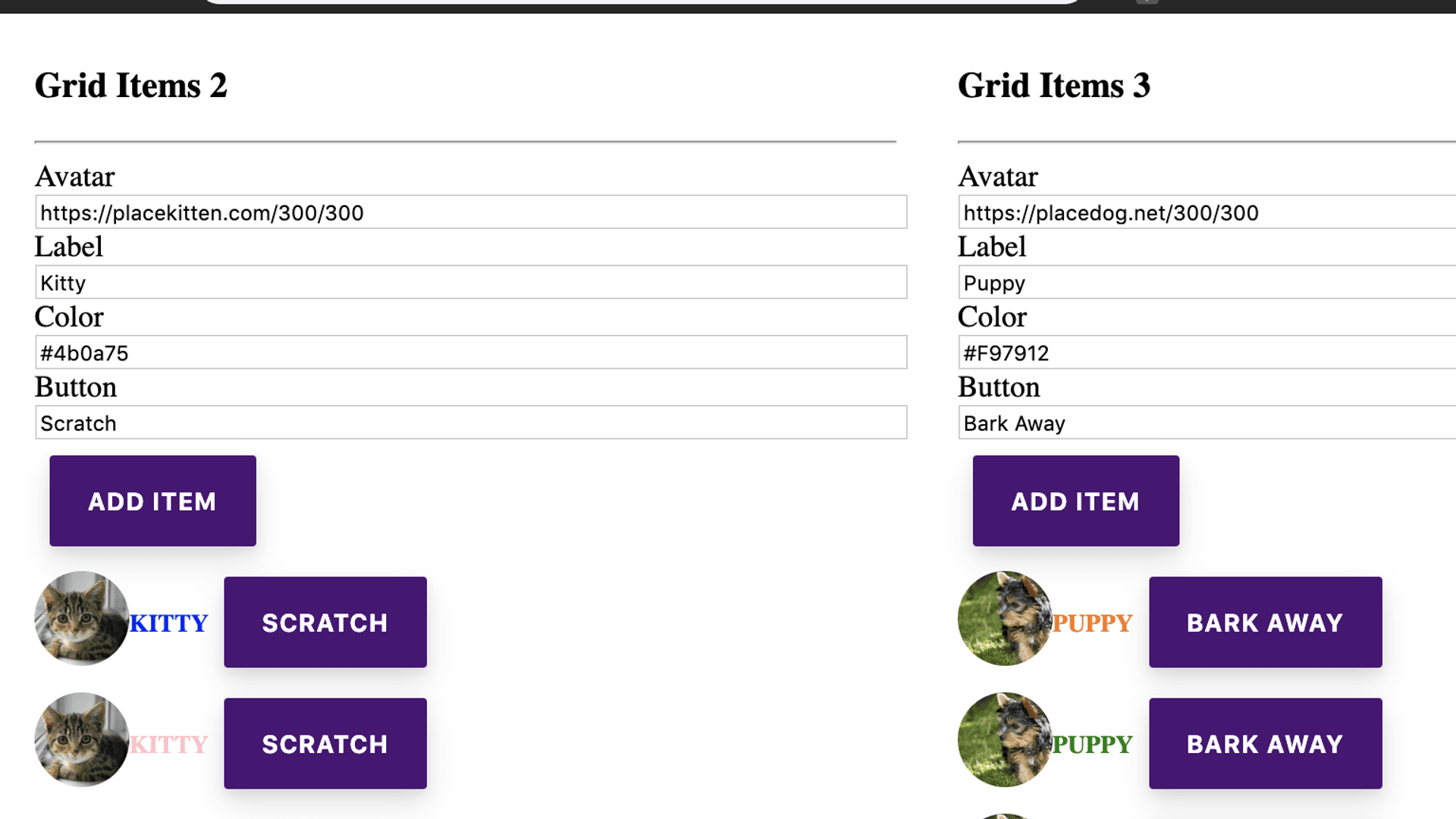
Now that we have a molecule we can use this inside of an organism, to repeat the molecule several times. We will take a very simple form which will allow us to add each of the ajonp-item molecules, but you will notice we are also going to use the ajonp-button atom inside this organism as well.
In hindsight maybe I should have called this a list
This grid starts to become more complex as it takes in @Props like our other components, but now we introduce @State so that our component can manage the internal data to that component, in our case all the items that belong within the grid. The final class property is @Elementwhich allows us to access the host HTMLElement, allowing us to find the form input fields and for each individual ajonp-item-grid.
src/components/ajonp-item-grid/ajonp-item-grid.tsx
import { Component, Element, Prop, State } from '@stencil/core';
import { Item } from '../../models/Item';
@Component({ tag: 'ajonp-item-grid', styleUrl: 'ajonp-item-grid.css' })
export class AjonpItemGrid {
	// Incoming Property elements
	@Prop() defaultColor: string;
	@Prop() defaultSrc: string;
	@Prop() defaultLabelText: string;
	@Prop() defaultButtonText: string;
	// State to track inside of the component
	@State() items: Item[] = []; //Host Element to access the form data instead of looking at entire document
	@Element() el: HTMLElement;
	addItem() {
		const item = new Item();
		item.src = (this.el.querySelector('#src') as HTMLInputElement).value;
		item.labelText = (this.el.querySelector('#labelText') as HTMLInputElement).value;
		item.color = (this.el.querySelector('#color') as HTMLInputElement).value;
		item.buttonText = (this.el.querySelector('#buttonText') as HTMLInputElement).value; //Add newly created Item to array non-mutated
		this.items = [...this.items, item];
	}
	scratchItem(key: number) {
		//Remove newly created Item to array non-mutated
		this.items = [...this.items.slice(0, key), ...this.items.slice(key + 1)];
		//Return an array from before the key and after the key.
	}
	render() {
		return (
			<div>
				{' '}
				<h3>Grid Items {this.items.length}</h3> <hr /> Avatar <input
					type="text"
					id="src"
					value={this.defaultSrc}
				/> <br /> Label <input type="text" id="labelText" value={this.defaultLabelText} /> <br /> Color{' '}
				<input type="text" id="color" value={this.defaultColor} /> <br /> Button <input
					type="text"
					id="buttonText"
					value={this.defaultButtonText}
				/> <br /> <ajonp-button onClick={this.addItem.bind(this)}>Add Item</ajonp-button> {this.items.map(
					(item: Item, key: number) => {
						return (
							<ajonp-item
								src={item.src}
								color={item.color}
								label-text={item.labelText}
								button-text={item.buttonText}
								onClick={this.scratchItem.bind(this, key)}
							/>
						);
					}
				)}{' '}
			</div>
		);
	}
}
src/components/ajonp-item-grid/ajonp-item-grid.css
input {
	width: 100%;
}
ajonp-item {
	display: flex;
}
Now if you look closely we are using the two organisms within our page, but we could also use them 100's of times in ANY of our pages!
index.html
<div style="display: flex; justify-content: space-around">
	<ajonp-item-grid
		default-src="https://placekitten.com/300/300"
		default-label-text="Kitty"
		default-color="#4b0a75"
		default-button-text="Scratch"
	></ajonp-item-grid>
	<ajonp-item-grid
		default-src="https://placedog.net/300/300"
		default-label-text="Puppy"
		default-color="#F97912"
		default-button-text="Bark Away"
	></ajonp-item-grid>
</div>
Templates
I am not going to dive into all of the code it would take to create a template, implementation but Ionic has offered up a solid solution for this as well in its Layout functionality. What is great here is that you can again work between your development and design team to quickly create a Hi-Fi Wireframe that will fit for your future components. I again have to say I love Figma, as anything built with Web Tech will always hold a special place in my heart. With that said an easy solution for this common task of creating templates can be found in Product Design Kit, checkout the Intro to Product Design Kit for Figma.
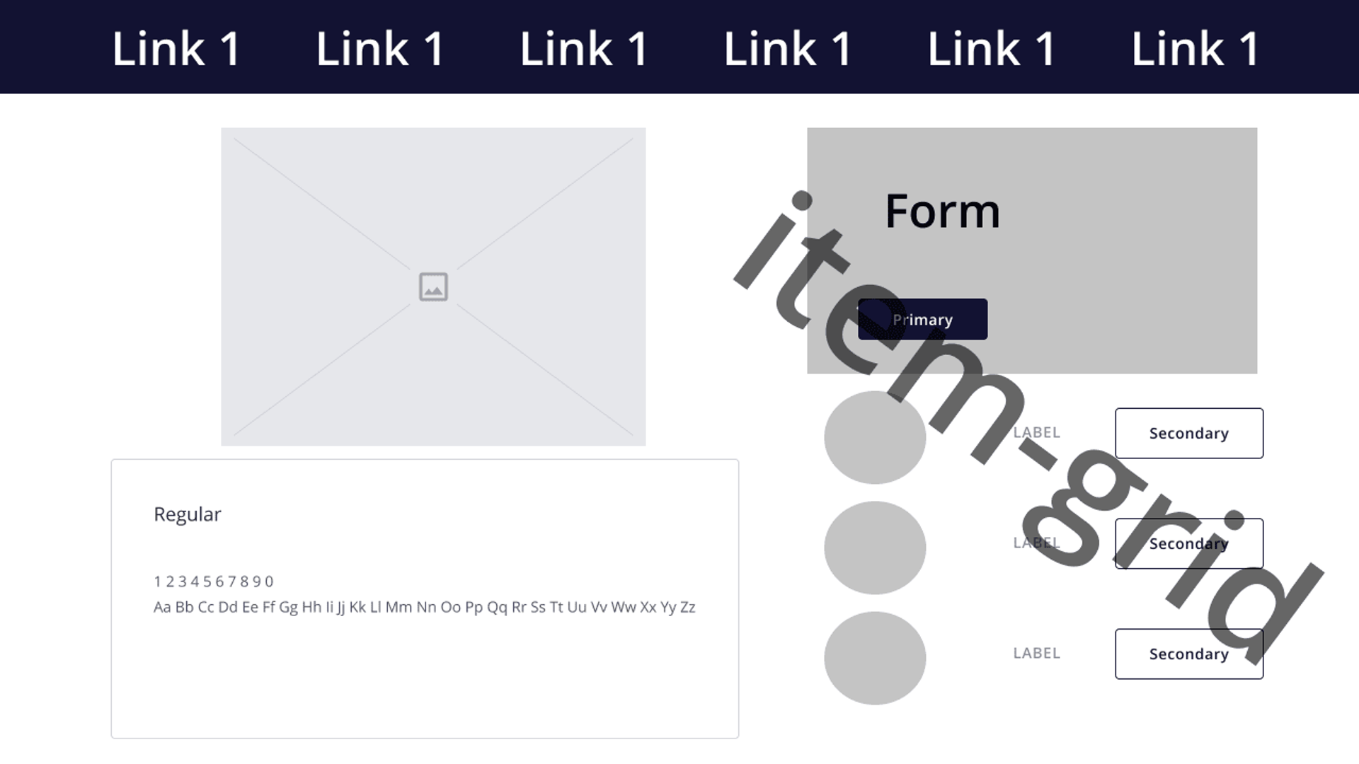
What we can do very quickly is setup the template for our page, so that the designers and developers can talk through breaking down all of the components and making sure that you have a template to be successful.
Please don't kill me I am not a designer (yes I should work with one). Here is an example of our template.
Pages
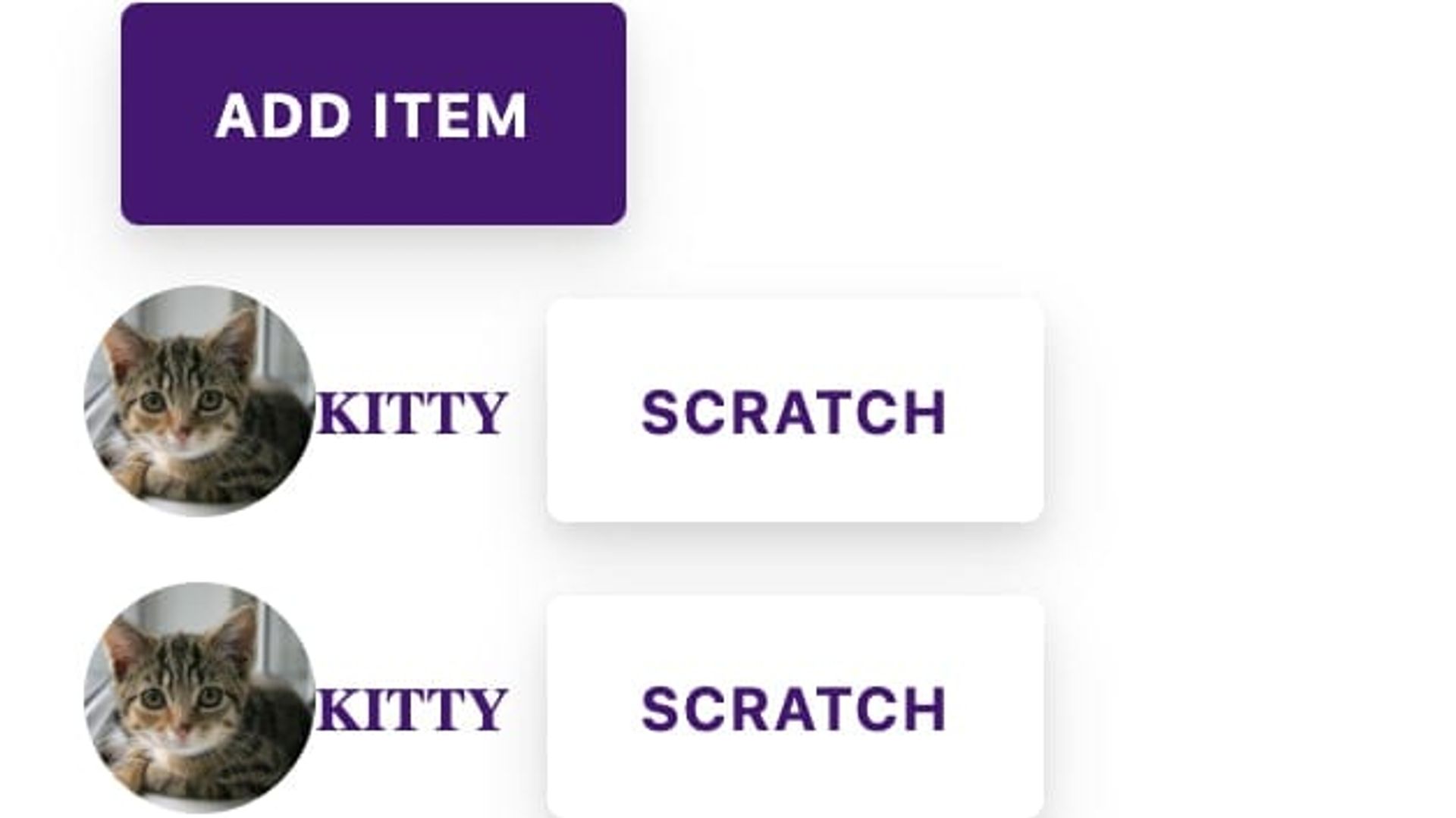
So what templates allow are us to see is that we can adjust our components right away. We can see that our ajonp-button will need to allow for both a primary and secondary type, so we should make sure to update a property to allow for that as well as the corner radius on all buttons should be the same, so we should update the css. The colors and content stay out of the way, until it is time to see page examples. Now we can start to see the real page as the user will interact with it on a daily basis, but because we built our entire system on components from the ground up we can adjust eact Atom, Molecule, and Organism to guarantee that we have the perfect fit in our system.
So something as simple as primary vs. secondary can be adjusted
button.primary {
	background: #4b0a75;
	color: white;
}
button.secondary {
	background: white;
	color: #4b0a75;
}
Creating and Adopting an Enterprise Design System
I have seen many great companies spend millions of dollars maintaining disparate systems, just in order to try and keep up with the pace of their marketing departments branding changes. An example of a disjointed company might have sites built utilizing Sitefinity, Adobe AEM, Angular, and React. Now on each of these stacks lets say they have built 5 different sites. In order to update just the button component across these systems would mean at best you need to change it in 4 places, but more than likely you will need to update it in 20 places then build, test, and deploy each of those systems.
In a component system this takes a single update to that component!!
Add central location
In order for the adoption to take place you will need to host your components in a centralized location like NPM. Here is a great guide on how to Publish to NPM. Because you worked so hard to create this system you will most likely want to keep it within your companies private npm registry.
How to be successful
You need to get buy-in from both departments and work as a cohesive unit to become truly successful, but in the end you will save multitudes of time and money!!!

