🧶 CSS AnimationsSection 3.1 · Lesson 3 of 4
Round Loading Indicator
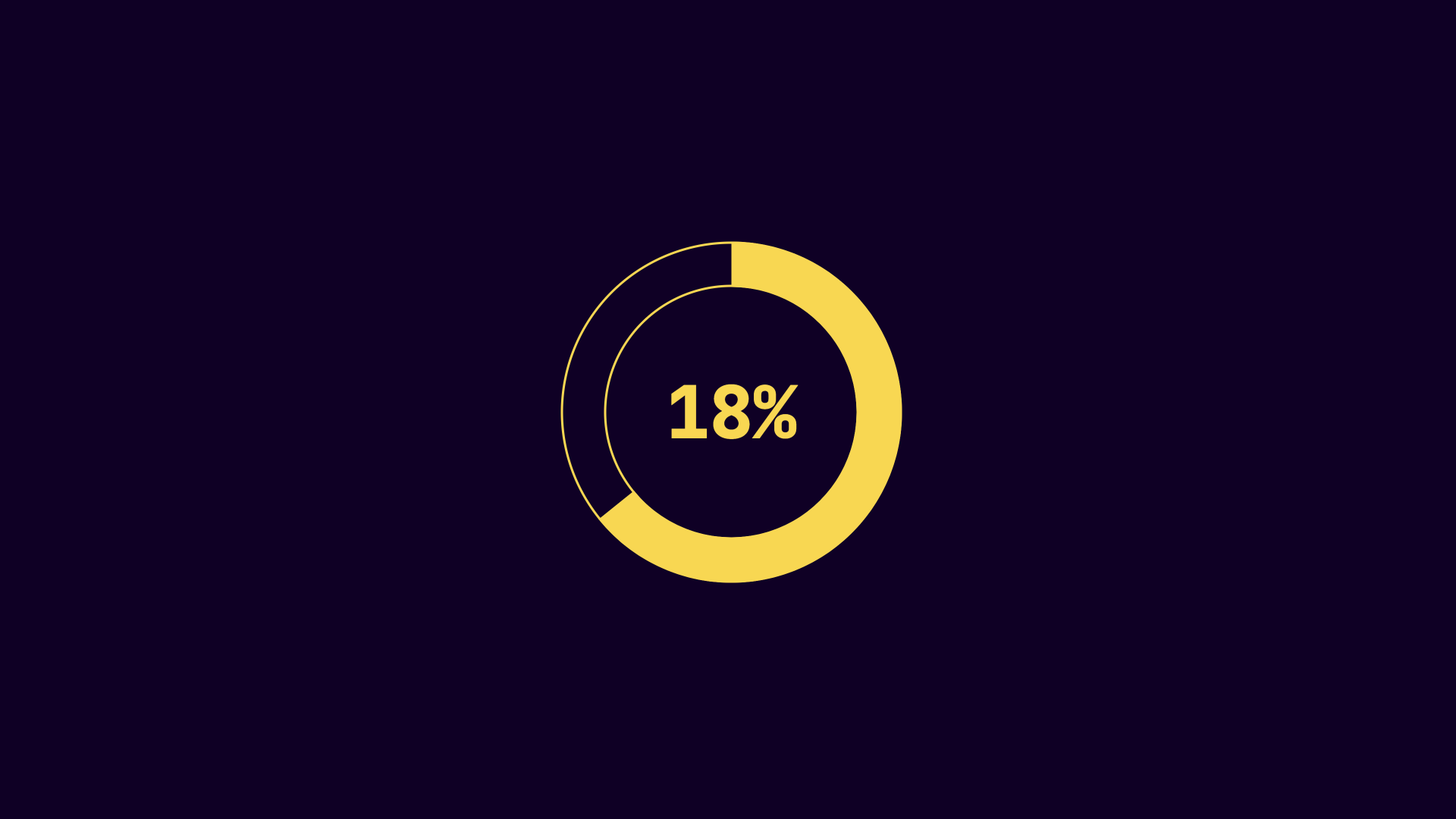
In this HTML snippet you can see that we are using a span that has a special data-value attribute. This allows us to store the current value on the HTML element depending on how much loading has occured. There is also a SVG element here that has a stroke yellow and what is more important though is the stroke width of 20, this will set how large the animated portion of the SVG will be displayed.
<div class="progress-circle">
	<span class="number" data-value="100"></span>
	<svg height="150" width="150" class="circle">
		<circle cx="75" cy="75" r="65" stroke="var(--yellow)" stroke-width="20" fill="none" />
	</svg>
</div>
In this CSS the broder-radius
.progress-circle{
  position: relative;
  width: 150px;
  height: 150px;
  border-radius: 50%;
  outline: 1px solid var(--yellow);
  outline-offset: -1px;
}
.progress-circle::after,
.number{
  position:absolute;
  top: 50%;
  left: 50%;
  transform: translate(-50%, -50%)
}
.progress-circle::after{
  content:'';
  width: 110px;
  height: 110px;
  border-radius: inherit;
  outline: inherit;
}
.circle{
  stroke-dasharray: 410;
  stroke-dashoffset: 410;
  transform: rotate(-90deg);
  animation: bar-fill 8s linear forwards;
  animation-iteration-count: infinite;
}
@keyframes bar-fill {
  100% {
    stroke-dashoffset: 0;
  }
}<div class="progress-circle">
  <span class="number" data-value="100"></span>
  <svg height="150" width="150" class="circle">
    <circle cx="75" cy="75" r="65" stroke="var(--yellow)" stroke-width="20" fill="none" />
  </svg>
</div><div class="progress-circle">
  <span class="number" data-value="100"></span>
  <svg height="150" width="150" class="circle">
    <circle cx="75" cy="75" r="65" stroke="var(--yellow)" stroke-width="20" fill="none" />
  </svg>
</div>
You will notice that in the below Codepen there is some JavaScript, this is just for updating the text to say true or false.
✏️ Visual Architecture Diagram
how this course connects together.
Follow AJ from first principles to production-ready architecture.
Let’s build it!
✏️ Visual Diagram: CSS Animations: Round Loading Indicator
✓ Good PatternVISUAL DIAGRAM
[Diagram Walkthrough]Step-by-step diagram breakdown for CSS Animations: Round Loading Indicator: start with Feedback, implement CSS Animations, and ship to production.
AAA Contrast Verified