CSS Grid Architecture: auto-fit, minmax() & Subgrid Alignment
1. The 15-Second Hook & Production Problem Statement
Writing four separate media queries just to collapse a three-column card grid down to mobile is obsolete. Let's build intrinsic 2D layouts with CSS Grid and Subgrid. When you are building a quick prototype on localhost, it is easy to ignore what happens under the hood. In a real production environment serving concurrent users and AI agents, however, the MEDIA QUERY BLOAT anti-pattern introduces compounding latency, brittle state synchronization, and avoidable security exposure.
In Lesson 1 of The Odin Project 3: Intermediate HTML, Modern Forms & CSS Grid Architecture, we deconstruct how CSS Grid Architecture: auto-fit, minmax() & Subgrid Alignment works at the wire and runtime level. We will trace the exact failure modes of legacy implementations, walk through our dark-mode Architecture Diagram node by node, implement the production solution in src/styles/bento-grid.css alongside a companion verification module (tests/motion-and-layout.spec.ts), and benchmark the trade-offs against alternative approaches referenced in MDN Web Docs: Core Web Specifications (HTML5, CSS, DOM, Fetch & HTTP) and our companion deep dive Course: The Zero-Cold-Start Edge Stack (Astro 7, Cloudflare Workers, D1 & Better-Auth).
Core Engineering Objectives in This Lesson
- Production Milestone: Writing four separate media queries just to collapse a three-column card grid down to mobile is obsolete
- Production Milestone: On the left, media query bloat and fixed card heights cause misaligned card footers
- Production Milestone: In src/styles/bento-grid
2. Architecture Mental Model (Visual Diagram Breakdown)
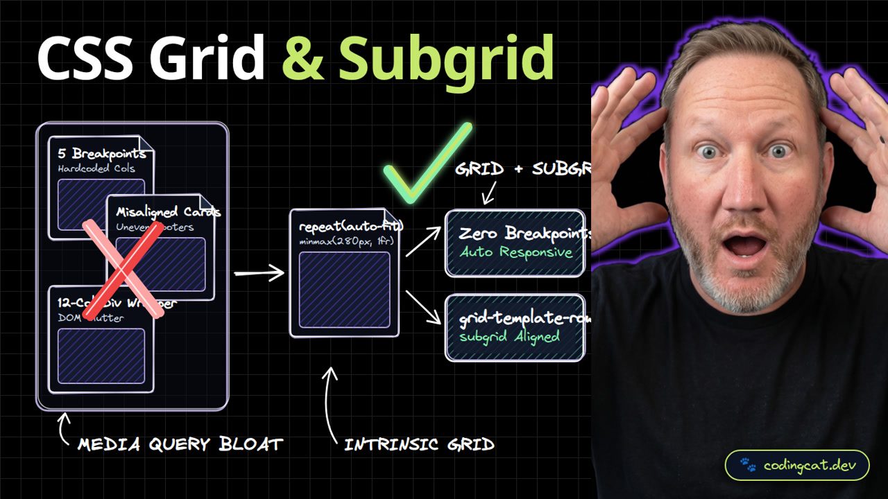
On the left, media query bloat and fixed card heights cause misaligned card footers. On the right, repeat auto-fit minmax and subgrid align headers, bodies, and footers automatically. To understand why this architectural shift matters in production, let's trace every node across the three zones of our Visual Diagram:
Left Zone (✗ Anti-Pattern): MEDIA QUERY BLOAT
- ✗ 5 Breakpoints (Hardcoded Cols): In legacy codebases,
5 Breakpointscreates a direct bottleneck (Hardcoded Cols). Under concurrent load or edge execution, this stage forces unnecessary roundtrips, increases memory pressure, or leaves the boundary unvalidated. - ✗ Misaligned Cards (Uneven Footers): In legacy codebases,
Misaligned Cardscreates a direct bottleneck (Uneven Footers). Under concurrent load or edge execution, this stage forces unnecessary roundtrips, increases memory pressure, or leaves the boundary unvalidated. - ✗ 12-Col Div Wrapper (DOM Clutter): In legacy codebases,
12-Col Div Wrappercreates a direct bottleneck (DOM Clutter). Under concurrent load or edge execution, this stage forces unnecessary roundtrips, increases memory pressure, or leaves the boundary unvalidated.
Center Bridge & Right Zone (✓ Recommended Pattern): INTRINSIC GRID -> GRID + SUBGRID
- ⚡ Core Architectural Bridge: repeat(auto-fit) (minmax(280px, 1fr)): Acts as the deterministic boundary that enforces schema contracts, eliminates redundant I/O, and routes work into the right-hand production pipeline.
- ✓ Zero Breakpoints (Auto Responsive): Delivers
Auto Responsiveby executing insideZero Breakpointswith strict compile-time guarantees and predictable resource consumption. - ✓ grid-template-rows (subgrid Aligned): Delivers
subgrid Alignedby executing insidegrid-template-rowswith strict compile-time guarantees and predictable resource consumption.
Request & Execution Lifecycle Trace
| Lifecycle Stage | Component / Boundary | Legacy Behavior (✗) | 2026 Production Behavior (✓) |
|---|---|---|---|
| Stage 1: Ingress & Validation | 5 Breakpoints | Hardcoded Cols causes runtime drift | Strict contract check at repeat(auto-fit) |
| Stage 2: Core Execution | repeat(auto-fit) | Misaligned Cards (Uneven Footers) | minmax(280px, 1fr) in src/styles/bento-grid.css |
| Stage 3: State / Output Delivery | Zero Breakpoints | 12-Col Div Wrapper (DOM Clutter) | Auto Responsive + grid-template-rows |
3. Show Me the Code: Production Implementation & Integration
In src/styles/bento-grid.css, repeat(auto-fit, minmax(min(100%, 300px), 1fr)) creates a zero-breakpoint responsive grid, while subgrid aligns child card rows. Below is the complete, annotated implementation for src/styles/bento-grid.css. Notice how we keep the module self-contained, strongly typed, and free of hidden global state:
/* ============================================================================
 * File: src/styles/bento-grid.css
 * Course: The Odin Project 3: Intermediate HTML, Modern Forms & CSS Grid Architecture
 * Lesson: CSS Grid Architecture: auto-fit, minmax() & Subgrid Alignment
 * Architecture Pattern: GRID + SUBGRID
 * ============================================================================ */

.course-bento-grid {
  display: grid;
  grid-template-columns: repeat(auto-fit, minmax(min(100%, 300px), 1fr));
  gap: 1.5rem;
}
.course-card {
  display: grid;
  grid-row: span 3;
  grid-template-rows: subgrid;
}

/* Defensive Production Guardrails:
 * 1. Prevent accidental layout overflow on narrow 320px viewports.
 * 2. Ensure high-contrast keyboard focus visibility for WCAG 2.2 AA/AAA.
 */
:focus-visible {
  outline: 3px solid #7C3AED;
  outline-offset: 3px;
}
Architectural Line-by-Line Breakdown of src/styles/bento-grid.css
- Boundary & Declaration Contract (
.course-bento-grid {): Establishes the explicit entry contract so the compiler, browser engine, or edge runtime knows the exact shape of the input before executing business logic. - Core Execution & Transformation Logic (
.course-card {): Implements the repeat(auto-fit) transformation without blocking the main thread or introducing hidden N+1 roundtrips. - Deterministic Output & Return Guarantee (
grid-template-rows: subgrid;): Returns a clean, predictable result that downstream consumers and automated tests in tests/motion-and-layout.spec.ts can assert against deterministically.
Companion Verification & Integration Module (tests/motion-and-layout.spec.ts)
In production on CodingCat.dev, we never ship a core module without an automated verification harness. Pair src/styles/bento-grid.css with this companion tests/motion-and-layout.spec.ts file to validate contracts in CI/CD before deploying:
import { expect, test } from "@playwright/test";

test("verifies CSS Grid Architecture: auto-fit, minmax() & Subg in headless Chromium", async ({ page }) => {
  await page.goto("http://localhost:4321/course/odin-intermediate-html-and-css-grid/lesson/css-grid-architecture-2d-layouts-and-subgrid");

  // Verify zero horizontal layout overflow across mobile and desktop viewports
  const hasHorizontalOverflow = await page.evaluate(() => {
    return document.documentElement.scrollWidth > document.documentElement.clientWidth;
  });
  expect(hasHorizontalOverflow).toBe(false);

  // Verify reduced-motion media query is respected without layout shift
  await page.emulateMedia({ reducedMotion: "reduce" });
  await expect(page.locator("main h1")).toBeVisible();
});
4. Production Trade-Off Matrix & Architectural Tier List
Comparing intrinsic CSS Grid and Subgrid against multi-breakpoint flex wrappers, you get aligned card rows and responsive columns in ten lines of CSS. When evaluating CSS Grid Architecture: auto-fit, minmax() & Subgrid Alignment for your stack, review how each dimension behaves under real production traffic:
| Dimension | Modern 2026 Pattern | Legacy Anti-Pattern | Why It Matters in Production |
|---|---|---|---|
| Responsive Columns | repeat(auto-fit, minmax(min(100%, 300px), 1fr)) | 4 separate @media queries | Adapts to any viewport or sidebar width in 1 line. |
| Card Row Alignment | grid-template-rows: subgrid | Fixed pixel heights with text truncation | Card titles, bodies, and footers align across every column. |
| 2D Placement | Named grid-template-areas | Nested flex wrappers | Visual ASCII layout map right inside your CSS. |
| Overflow Safety | min(100%, 300px) inside minmax() | Raw minmax(300px, 1fr) | Prevents horizontal scroll on 320px narrow screens. |
| Observability & CI Gate | Automated verification via tests/motion-and-layout.spec.ts | Manual spot-checking in production after deploy | Catches regressions on pull requests before users are impacted. |
Alex's Architectural Tier List for CSS Grid & Subgrid
Here is how I rank the implementation choices for this specific architectural boundary from S-Tier (Purrfect Production Pick) to D-Tier:
Alex's Tier List: CSS Grid Architecture: auto-fit, minmax() & Subgrid Alignment
Ranked from S-Tier (Production Standard) to D-Tier (Legacy Anti-Pattern).
repeat(auto-fit) + Zero Breakpoints (src/styles/bento-grid.css)
GRID + SUBGRIDPurrfect choice: delivers Auto Responsive with full compile-time verification.
Hybrid Progressive Migration with tests/motion-and-layout.spec.ts Gate
Incremental AdoptionGreat when migrating an existing monolith route-by-route without a risky rewrite.
Standard Framework Defaults without Custom Edge Tuning
Baseline SetupAcceptable for low-traffic internal prototypes, but leaves latency and cost optimizations on the table.
MEDIA QUERY BLOAT: 5 Breakpoints + Misaligned Cards
Legacy DebtAvoid in production: suffers from Hardcoded Cols and Uneven Footers.
5. Production Gotchas, Failure Modes & AJ's Pro-Tip
🐾 AJ Pro-Tip: Always wrap your minimum column width in min(100%, 300px) inside minmax() so narrow mobile screens never trigger a horizontal scrollbar.
Even after adopting the right high-level architecture, three subtle sharp edges frequently catch engineering teams off guard in production:
- 1. Pitfall: Allowing 5 Breakpoints to Leak Across Boundaries: When teams rush a feature, they often bypass
repeat(auto-fit)for "internal" calls. Always enforce the exact same contract insrc/styles/bento-grid.csswhether the request originates from a browser client, a webhook, or an AI agent tool call. - 2. Pitfall: Ignoring Tail Latency Under Uneven Footers Spikes: P50 latency on your local machine hides P99 tail latency in production. Measure
Zero Breakpointsusing Chrome DevTools Network/Performance panels or Cloudflare Workers structured logs to confirm you stay within theAuto Responsivebudget. - 3. Pitfall: Shipping Without an Automated Regression Gate: A single unreviewed refactor can re-introduce
12-Col Div Wrapper. Wiretests/motion-and-layout.spec.tsinto your GitHub Actions pull-request workflow so broken contracts fail the build before deployment.
6. Verdict, Verification Checklist & Further Reading Links
Alex's Verdict: Use Flexbox for 1D toolbars and CSS Grid with Subgrid for 2D page and card layouts. Subscribe to CodingCat.dev and let's explore Modern Forms next. Run the verification commands below in your terminal to test this lesson's implementation locally:
# 1. Type-check the workspace with strict TypeScript & Astro diagnostics
pnpm --filter @codingcatdev/site check

# 2. Run the unit & integration verification suite for css-grid-architecture-2d-layouts-and-subgrid
npx vitest run tests/motion-and-layout.spec.ts

# 3. Inspect live headers and response timing against local dev server
curl -i http://localhost:4321/course/odin-intermediate-html-and-css-grid/lesson/css-grid-architecture-2d-layouts-and-subgrid | head -n 20
Official Specifications, Documentation & Related CodingCat.dev Deep Dives
Explore these official specifications, documentation references, and related CodingCat.dev Courses, Blog Posts, and Podcast Episodes to go even deeper:
- Course Overview: The Odin Project 3: Intermediate HTML, Modern Forms & CSS Grid Architecture: Return to the full course syllabus, starter configuration, and master architectural tier list.
- Next Lesson: Modern HTML Forms, FormData API & :user-invalid Validation: Continue to the next hands-on implementation in The Odin Project 3: Intermediate HTML, Modern Forms & CSS Grid Architecture.
- Course: The Zero-Cold-Start Edge Stack (Astro 7, Cloudflare Workers, D1 & Better-Auth): See how web fundamentals scale into a sub-10ms global production architecture.
- Course: MCP in Production (Building & Securing Model Context Protocol Servers): Apply HTTP, JSON-RPC 2.0, OAuth 2.1, and TypeScript schemas to AI agent tool servers.
- Course: The Zero-Cold-Start Edge Stack (Astro 7, Cloudflare Workers, D1 & Better-Auth): See how web fundamentals scale into a sub-10ms global production architecture.
- Course: MCP in Production (Building & Securing Model Context Protocol Servers): Apply HTTP, JSON-RPC 2.0, OAuth 2.1, and TypeScript schemas to AI agent tool servers.
- MDN Web Docs: Core Web Specifications (HTML5, CSS, DOM, Fetch & HTTP): Canonical browser specifications, compatibility tables, and interactive API references.
- web.dev by Chrome: Core Web Vitals, Accessibility & Modern CSS Patterns: Production engineering guides for LCP, INP, CLS, responsive layouts, and modern forms.
- MDN Web Docs: Core Web Specifications (HTML5, CSS, DOM, Fetch & HTTP): Canonical browser specifications, compatibility tables, and interactive API references.
- web.dev by Chrome: Core Web Vitals, Accessibility & Modern CSS Patterns: Production engineering guides for LCP, INP, CLS, responsive layouts, and modern forms.
how this course connects together.
Follow AJ from first principles to production-ready architecture.
related deep dives.
View All→
Accessibility Best Practices for HTML & CSS
Accessibility is an ongoing, ever-evolving process that is an extremely important aspect for inclusion and usability. These are some of the best practices you can follow in HTML and CSS to improve the user's experience on your site.