CSS Box Model, Cascade Specificity & the Flexbox Layout Engine
1. The 15-Second Hook
If adding padding to a card still makes it overflow its container, or you find yourself guessing between justify-content and align-items, this lesson will lock in the CSS Box Model and Flexbox forever.
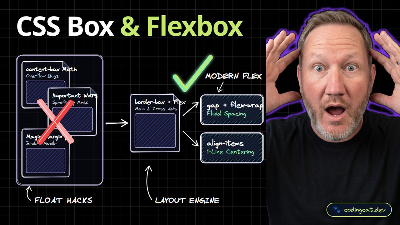
2. Architecture Mental Model (Visual Diagram)
On the left, default content-box sizing and !important wars cause layout bugs. On the right, border-box and Flexbox control the main axis and cross axis with gap and flex-wrap.
3. Show Me the Code (src/styles/layout.css)
*, *::before, *::after {
  box-sizing: border-box;
}
.course-toolbar {
  display: flex;
  flex-wrap: wrap;
  align-items: center;
  justify-content: space-between;
  gap: 1rem;
}
In src/styles/layout.css, we reset all elements to box-sizing border-box and use display flex with flex-wrap, align-items center, justify-content space-between, and gap.
4. Production Trade-Off Matrix
Comparing modern border-box and Flexbox against legacy float hacks, you get predictable widths, one-line vertical centering, and intrinsic responsive wrapping.
5. Verdict & AJ Pro-Tip
AJ Pro-Tip: Use the gap property on flex containers instead of margin-right on children so you never have to strip trailing margins with :last-child.
Remember: justify-content follows the main axis and align-items follows the cross axis. Subscribe to CodingCat.dev and let's wire up JavaScript DOM events in Lesson 4.
how this course connects together.
Follow AJ from first principles to production-ready architecture.